 |
| Something like this. |
After all these years of reffing without one, I'm going to try out using a DM screen. Here's why.
I've been playing in Steve's game. He has used a DM's screen. What I like about it is that there are vertical surfaces for him to clip things to, and he can hide the map from us. I think this makes him a better DM.
And when I ref for my son and daughter and their friends, I feel like I'm a little scatterbrained even though I've boiled the rules down to where I can keep them all in my head. Additionally, I would like to provide the info to the players that they need but is not on their sheets.
I like the vertical surfaces, both ref-facing and player-facing, for these reasons.
So what do I put on my DM screen?
The first decision to make is, should it have three panels or four? Or more? Or less? So let's work through that.
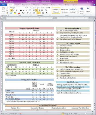
DM Side Panel 1:
- Monsters Attack Roll Matrix
- Characters Attack Roll Matrix
- Saving Throw Matrix
- Exploration Turn Steps
- Combat Round Steps
- Wilderness Day Steps
- Quick Reference for a couple of rules that come up all the time
- Wilderness Table: Encounter Chance, Lost Chance, and Mounted Travel Distance per day versus Terrain Type
Luckily, all this can fit on one panel. And with the marvels of modern desktop publishing, even a duffer like me can make it look presentable.
Here's a link to the Word file.
The other panels on the DM's side will be modular.
DM's Side Panel 2: The map
DM's Side Panel 3: The key
DM's Side Panel 4: Wandering monsters by dungeon level; wandering monsters for the terrain outside the dungeon.
So, that's four panels. Cool.
I've also decided to do them portrait-layout, but I don't know if that's the right way to do it. I may end up doing 4 12" by 12" panels so I can lay things out portrait or landscape as necessary.
Now I know I have four panels to work with on the Players' Side too. What do I want to show them?
The first thing is that the charts I show them must be larger so that they are legible 6-8 feet away. The fonts need to be bigger.
Player's Side Panel 1: Let's keep the same pattern as we did for the DM's side. Panel 1 for the players needs less info.
- Characters Attack Roll Matrix
- Characters Saving Throw Matrix
- Exploration Turn Steps
- Combat Round Steps
- Wilderness Day Steps
Here's a link to the PDF.
Here's a link to the Word file.
Player's Side Panel 2:
- Adventuring Equipment
- Armor and Shields
- Weaponry
This might actually have to be two panels. There's a lot of stuff to buy in town. I want to keep the stuff you can only buy in a city separate, and only give that as a handout when they get into The Big City. This includes exotic mounts, warships, and most alchemy items.
I haven't worked all that out yet either.
However, here is a link to the Excel spreadsheet I am using to lay out all the charts. Maybe they will be of use to you. I will update this spreadsheet while I work on it.
In the next few days, I will share with you the several panels on the players side. I will lay out a generic wandering monster table for the dungeon, per Holmes. I think he did a good job with that.
I am interested in seeing example wandering monster tables for the several terrain types. Do you have any that you've made up, or can you direct us to where we might see the ones you took for your home game?

No comments:
Post a Comment